> ## Documentation Index
> Fetch the complete documentation index at: https://docs.propaga.mx/llms.txt
> Use this file to discover all available pages before exploring further.
# Using Propaga button
To implement the Propaga Button in the file header, you'll need to import the global hook.
```js theme={null}
import { usePropaga } from '@propaga/react-native-sdk';
```
And here's how you can use the hook:
```js theme={null}
const MyAwesomeComponent = () => {
const { ... } = usePropaga();
return ( ... );
}
```
### Working with Propaga button
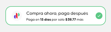
You can easily implement a ready-to-use checkout button like this:
With the following snippet, implementing the button becomes straightforward:
```jsx theme={null}
import { useState } from 'react';
import { View, Button } from 'react-native';
import { usePropaga } from '@propaga/react-native-sdk';
export default function App() {
const [isPropagaActive, setIsPropagaActive] = useState(false);
const { PropagaButton } = usePropaga();
return (
{
setIsPropagaActive(!isPropagaActive);
}} />
);
}
```
This button is designed to display a checked state, ideal for use as a component on your check-out screen.